Discussion Map Location Help

Rush

Administrator
Staff member
Mar 12, 2020
3,752
8
526
113
We need your help to fill up our new Interactive Map of Sanctuary!

If you spot a location or a point of interest such as an Altar of Lilith, right click on the map to add a temp marker, copy the link to share, and paste it in this thread.

This will help us populate the map over the coming days.
 
Temple of Lillith - Well apparently the link takes me to an even different place... So I can't set markers and share.

Also right clicking on the map zooms me way out and puts a marker in a random place, very hard to put a marker down.
 
Hello!

I would like to help build your interactive map by performing a review of its data and correcting missing information. My main strengths I bring are being very precise and detail-oriented, reviewing for accuracy, and other general editorial skills.

I have worked on an interactive map before: Zelda Dungeon's one for BotW. If you google "Breath of the Wild map" ZD's is the first result, and I like to feel like I helped get it that way! I was one member of a team, of course, but I was one of the biggest contributors.

Part of the reason I think ZD's map still ranks first to this day is because it was first up, first to be accurate, and stylistically matches the game as much as possible. You're already winning on some of those!

Here's some pointers/suggestions I think will help you perfect the experience:
  • The actual map layer itself is incorrect and seems to be based on the prologue before "the storm clears", especially southwest of Kyovashad.
  • Altar of Lilith icons should be updated to match in-game visuals. As the icons only appear on your in-game map in a 'completed' state, you may need to photoshop an 'uncompleted' state for use on your map.
  • It's great to include a screenshot from the game with each icon on the map, especially for Altar of Lilith locations which may be a bit sneaky
  • Dungeons currently don't indicate the aspect you get for completing them, and they should.
  • Being able to filter dungeons by class would be very helpful. Also should apply class filter to quests and anything else applicable.
  • Being able to 'mark as complete' would be helpful. Even better if you allow us to have multiple 'characters' (up to 10 like the game does) and mark as complete for each!
  • 'Region' should be called 'Area' and update icon to match. The red outline it currently has stands out too much to others. Alternatively, you could draw polygons around the areas. The areas themselves are a collectible so should be treated as such.
  • The ALL CAPS NAMES on each pin are big and in caps; stylistically it would be better to match in-game font, size, and case, as much as possible.
  • Blue exclamation mark should not be NPC, it should be reserved for side quests.
  • If you must map NPCs (they aren't a collectible or related to any challenge so far as I know yet), I suggest the in-game 'has dialogue' icon, the rectangular speech bubble. But honestly I don't currently see a need to map NPCs.
  • You need a new category for super-rare enemy sightings and world bosses. I would use the in-game 'skull' icon used to represent a boss.
  • Your "event" icon should be updated to match in-game icon. It's like an orange-and-white triangle.
  • Note that 'events' are always in the same spots but not always the same event, so, some event markers need to be able to list the multiple possible events that occur in that spot. (I'm pretty sure of this fact, maybe I'm wrong.)
  • You should group all the town 'services' into a category called...services, and be able to filter for those.
  • Your town/waypoint icons should list the 'services' for that area just like in-game does.
  • The 'Quest' icon should be separated to better match the three types of in-game quest (yellow, white, blue).
  • Main campaign quests should indicate which 'step' of the quest they are, when applicable.
  • Side quest 'objective' locations should use the in-game blue diamond icon. Even better if you can also paint regions like in-game.
  • When you have a quest or objective selected, highlight the other related pins on the map (like the start of the quest or its objectives, if you select one or the other) by dimming unselected items.
And so on and so forth, gotta get to work.

I plan to play all next weekend and will be able to help with data collection and review at that time if you wish, which should give us a good headstart for when the game actually launches in June. If you don't want to let me join the team and give me direct access to do the reviewing and editing, then I'll submit what I can through this forum channel, but it could be a lot and a bit spammy.

I hope you consider my suggestions! See you next weekend!
 
Last edited:
Hello!

I would like to help build your interactive map by performing a review of its data and correcting missing information. My main strengths I bring are being very precise and detail-oriented, reviewing for accuracy, and other general editorial skills.

I have worked on an interactive map before: Zelda Dungeon's one for BotW. If you google "Breath of the Wild map" ZD's is the first result, and I like to feel like I helped get it that way! I was one member of a team, of course, but I was one of the biggest contributors.

Part of the reason I think ZD's map still ranks first to this day is because it was first up, first to be accurate, and stylistically matches the game as much as possible. You're already winning on some of those!

Here's some pointers/suggestions I think will help you perfect the experience:
  • The actual map layer itself is incorrect and seems to be based on the prologue before "the storm clears", especially southwest of Kyovashad.
  • Altar of Lilith icons should be updated to match in-game visuals. As the icons only appear on your in-game map in a 'completed' state, you may need to photoshop an 'uncompleted' state for use on your map.
  • It's great to include a screenshot from the game with each icon on the map, especially for Altar of Lilith locations which may be a bit sneaky
  • Dungeons currently don't indicate the aspect you get for completing them, and they should.
  • Being able to filter dungeons by class would be very helpful. Also should apply class filter to quests and anything else applicable.
  • Being able to 'mark as complete' would be helpful. Even better if you allow us to have multiple 'characters' (up to 10 like the game does) and mark as complete for each!
  • 'Region' should be called 'Area' and update icon to match. The red outline it currently has stands out too much to others. Alternatively, you could draw polygons around the areas. The areas themselves are a collectible so should be treated as such.
  • The ALL CAPS NAMES on each pin are big and in caps; stylistically it would be better to match in-game font, size, and case, as much as possible.
  • Blue exclamation mark should not be NPC, it should be reserved for side quests.
  • If you must map NPCs (they aren't a collectible or related to any challenge so far as I know yet), I suggest the in-game 'has dialogue' icon, the rectangular speech bubble. But honestly I don't currently see a need to map NPCs.
  • You need a new category for super-rare enemy sightings and world bosses. I would use the in-game 'skull' icon used to represent a boss.
  • Your "event" icon should be updated to match in-game icon. It's like an orange-and-white triangle.
  • Note that 'events' are always in the same spots but not always the same event, so, some event markers need to be able to list the multiple possible events that occur in that spot. (I'm pretty sure of this fact, maybe I'm wrong.)
  • You should group all the town 'services' into a category called...services, and be able to filter for those.
  • Your town/waypoint icons should list the 'services' for that area just like in-game does.
  • The 'Quest' icon should be separated to better match the three types of in-game quest (yellow, white, blue).
  • Main campaign quests should indicate which 'step' of the quest they are, when applicable.
  • Side quest 'objective' locations should use the in-game blue diamond icon. Even better if you can also paint regions like in-game.
  • When you have a quest or objective selected, highlight the other related pins on the map (like the start of the quest or its objectives, if you select one or the other) by dimming unselected items.
And so on and so forth, gotta get to work.

I plan to play all next weekend and will be able to help with data collection and review at that time if you wish, which should give us a good headstart for when the game actually launches in June. If you don't want to let me join the team and give me direct access to do the reviewing and editing, then I'll submit what I can through this forum channel, but it could be a lot and a bit spammy.

I hope you consider my suggestions! See you next weekend!
Thanks for the feedback and input. Some of these we are aware of and will be or have been remedied already. Awesome feedback though so thanks.

This really is a first iteration and we will be working on it over the week before the open beta. I have a more thing to add to the map too which will pop in this week.

I'll drop you a DM here on the forum tomorrow as it's late here at the moment :)
 
Hi Guys,

I and a few guys were playing D4 at the last weekend and using the interactive map for reference. During the last days it got updated more often and looks great so far. But there is one thing I would like to see changed. The right big filter and search frame is covering a good portion of the monitor and it would be great to have an option to collapse/expand it as its the case with other games interactive maps i.e New world. Below is a direkt link to it for reference.


Greetings
We have just updated the UI now. See if that has helped for you. Also what are you using? Mobile, desktop, and what resolution?
 
Thanks for the quick reply. Hm what exactly did you change? The right frame seems to have no modifikation and cannot be collapsed. I am on desktop with 2560x1440(WQHD). Did you had a look at my New work example? There you can collapse both sides and have a full view on the screen.

Another thing I forgot to mention. It is possible to add some more zoom steps/levels? The gradations are too rough.
Hopefully its understandable, I am no native speaker ^^

By the way I just found another D4 map which have the option to collapse/expand the frame, but I find your map actually better with icons using ingame visuals, would be great you can implement the collaps/expand modifikation.

 
Last edited:
Thanks for the quick reply. Hm what exactly did you change? The right frame seems to have no modifikation and cannot be collapsed. I am on desktop with 2560x1440(WQHD). Did you had a look at my New work example? There you can collapse both sides and have a full view on the screen.

Another thing I forgot to mention. It is possible to add some more zoom steps/levels? The gradations are too rough.
Hopefully its understandable, I am no native speaker ^^

By the way I just found another D4 map which have the option to collapse/expand the frame, but I find your map actually better with icons using ingame visuals, would be great you can implement the collaps/expand modifikation.

This is actually being done now. Should be live when it's done and will be before beta starts.

Note we are moving to a faster server so that migration completes tomorrow so we are having to hold off deploying some new stuff until them.

We have more lined up to add which will be worked on over beta and beyond so stay tuned :)
 
Thanks for the quick reply. Hm what exactly did you change? The right frame seems to have no modifikation and cannot be collapsed. I am on desktop with 2560x1440(WQHD). Did you had a look at my New work example? There you can collapse both sides and have a full view on the screen.

Another thing I forgot to mention. It is possible to add some more zoom steps/levels? The gradations are too rough.
Hopefully its understandable, I am no native speaker ^^

By the way I just found another D4 map which have the option to collapse/expand the frame, but I find your map actually better with icons using ingame visuals, would be great you can implement the collaps/expand modifikation.

The minimise the bar has now been added :)
 
it seems there was already an Update :) Thanks for implementing.

Its now possible to collapse the frame. Another thing I observed (maybe its already known) when opening the map and moving to left or right or zooming in/out there is sometimes a black bar which disappears once you move a bit more
to right/left. Its nothing major, a minor issue but if fixable would be not bad :)

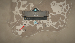
Example Screenshot
 
Last edited:
it seems there was already an Update :) Thanks for implementing.

Its now possible to collapse the frame. Another thing I observed (maybe its already known) when opening the map and moving to left or right or zooming in/out there is sometimes a black bar which disappears once you move a bit more
to right/left. Its nothing major, a minor issue but if fixable would be not bad :)

Example Screenshot
To save on load times, this is the way the system works, it only loads in what you are viewing so when you move it the images load in. It's to help optimization for stuff like mobile view. We'll see if we can sort that anomaly but the priority is getting things ready for the open beta weekend.

We are now working on the zones and that should all go in OK as well. We have more data to input tomorrow based on our Wiki content which will also help players find out more about stuff. Expect things to all fall into place shortly :) Thanks for the patience!
 
  • Like
Reactions: Dredd
PurePremium
Estimated market value
Low
High